Dark, moody, and fast.
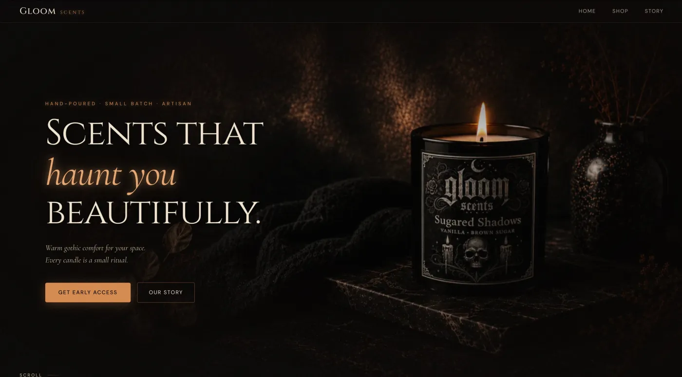
A hand-poured gothic candle brand with a strong look and no interest in looking like a template store. The site had to feel like the product, sell it, and still load instantly on a phone, which is where heavy photography usually goes wrong.
The numbers
Page counts from the live sitemap; performance from Google's Lighthouse test, mobile preset, measured November 1, 2026. Run it yourself ↗
What the site had to do
Gloom Scents sells a focused range of candles with names like Sugared Shadows and Violet Dream. The brand is the product; a Shopify theme would have flattened it.
The brief: a store that is unmistakably Gloom from the first pixel, with product pages Google understands, photography that does the selling, and a cart and checkout built in rather than rented.
Everything on the list
All of it checkable on the live site. Click through and look.
- Product pages Google can readEach candle carries product schema: name, images, availability, so it can appear in Shopping results.
- Full-bleed photography that still loadsImages cut for the screen they land on and loaded as they come into view; the whole page is 372 KB.
- Cart and checkout built inNo monthly platform fee and no cut of each sale.
- A brand story and a candle-care pageThe pages people share and the pages that cut support emails.
- Organisation schema and InstagramThe brand marked up as a brand, with Instagram pointing back to the products.
- A 100/100/100/100 mobile scoreWith the photography. That is the point.
Google's own test
Lighthouse 12, mobile preset, on the live homepage. Most small-business sites land in the 50s to 70s on performance.
Largest content painted in 1.6 s on a throttled phone connection. What the four scores mean →
Three decisions
The brand sets the rules
"Scents that haunt you beautifully" is a design brief. Everything on the page follows it; nothing on it looks like a stock store.
Photography as the sales pitch
So the engineering went into making big images fast rather than making them small.
Own the store
Custom cart and checkout means the margin stays with the maker.
More like this: how I build for online stores · the full gallery
Want a site like this one?
Tell me about your business and I'll reply within a day with next steps or a rough quote. It starts with a free 15-minute call, and there's no obligation.
Start Your Project →